Proudnoob4

Posts : 49
Join date : 2015-06-13
 |  Subject: Art Critique Please ! Sun 2 Oct 2016 - 14:25 Subject: Art Critique Please ! Sun 2 Oct 2016 - 14:25 | |
|
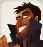
Hello i made some art for G.U.N Please if you have any critiques it will be greatly appreciated !
_________________ 
Last edited by Proudnoob4 on Sun 7 May 2017 - 7:02; edited 1 time in total |
|
IIHawkerII
Posts : 519
Join date : 2015-03-18
Age : 31
Location : Nu Ziland
Character sheet
Name: Conroy El Cadera
Faction: Independant
Level: 49
| | Subject: Re: Art Critique Please ! Sun 2 Oct 2016 - 18:06 | |
| I love your work with the lighting in this picture!
That being said, there's a few bits I'd like to draw your attention to. (It is a critique after all. =P )
-First thing is the lettering on the flag, you've done a pretty good job of re-sizing the letters to simulate the waving of the flag, the only thing I can see there worth fixing is the 'N', I'd say make it a little larger, about (Or close to.) the size of the 'G'. Might help fill up that other half of the flag there. =)
-Second thing is the hands on your astronaut. And boy, do I feel your pain. >_<
I'm no artist, but I like drawing, and yikes... The hands always trip me up.
Here they seem a little... Off. I'm not sure what to tell you really, they just don't
seem to fit. Sorry if that's a little vague. ._.
-Last thing is the stars in the background. (Assuming they are stars!) It's a great addition and I'm glad you added so many of them. The only thing is... They seem a little over-powered by the foreground picture which is quite a bit brighter than these burning balls of space-gas. Perhaps running a few stars through photoshop with a slight, bright glow setting? Just to make 'em stand out a little bit.
I really can't find anything else worth noting here. Excellent work overall! I can tell this was done free-hand with some love. =D
(P.S: Feel free to shoot me down on any of these if they don't line up. o7 ) _________________ 
And I find, on my way to death and happiness,
that my heroes, my heroes dress in black.
|
|
Proudnoob4
Posts : 49
Join date : 2015-06-13
| | Subject: Re: Art Critique Please ! Sun 2 Oct 2016 - 18:12 | |
| @"IIHawkerII" Yes i do see the hands are tiny,  Very tiny i do have to account to that next time Thanks!, And i do see the letters are kinda off i tried to simulate that its kinda farther back than the 'G' but i think i did not simulate that well, Thanks for that too. And the stars was a brush i found on the internet lol, so next time ill just do those individually next time i do a space setting, Thank you for the Critique  _________________ |
|
Tr3ach3ry
Posts : 336
Join date : 2014-03-27
Age : 33
Location : Forge world Mars
| | Subject: Re: Art Critique Please ! Sun 2 Oct 2016 - 18:38 | |
| A little bit more movement .The pose is kinda stiff and bigger hands .Everything esle ish oke.
Still better than what i can draw , alot better. |
|
Proudnoob4
Posts : 49
Join date : 2015-06-13
| | Subject: Re: Art Critique Please ! Sun 2 Oct 2016 - 18:39 | |
| - Tr3ach3ry wrote:
- A little bit more movement .The pose is kinda stiff and bigger hands .Everything esle ish oke.
Still better than what i can draw , alot better. Movement is pretty stiff i must admit gotta do some more studies on posture, Thanks ! _________________ |
|
RaidSnake

Posts : 88
Join date : 2014-03-02
Age : 31
Location : France, Paris
| | Subject: Re: Art Critique Please ! Mon 3 Oct 2016 - 9:00 | |
| yes, better hands, bigger! but I like the idea and the character! _________________  |
|
Tr3ach3ry
Posts : 336
Join date : 2014-03-27
Age : 33
Location : Forge world Mars
| | Subject: Re: Art Critique Please ! Fri 7 Oct 2016 - 15:56 | |
| - Proudnoob4 wrote:
- Tr3ach3ry wrote:
- A little bit more movement .The pose is kinda stiff and bigger hands .Everything esle ish oke.
Still better than what i can draw , alot better. Movement is pretty stiff i must admit gotta do some more studies on posture, Thanks ! No probs . There are a lot of tutorials on how to add ...some kind of motion to the drawing .But eventually you will get the hang of it . |
|
SpookyBees

Posts : 14
Join date : 2015-04-18
Age : 24
Character sheet
Name: Character
Faction:
Level:
| | Subject: Re: Art Critique Please ! Thu 13 Oct 2016 - 7:44 | |
| Really cool man! Hands are a bit disproportionate but I think it's really cool! _________________  |
|
Sponsored content
| | Subject: Re: Art Critique Please ! | |
| |
|